


What’s the first thing your customers notice when they walk into your restaurant?
It’s not your specials, or the hostess, or the crowd.
Would it surprise you to learn that it’s the color palette?
Before guests even see the menu or speak to a server, the color palette of your restaurant décor is already shaping how they feel, what they expect, and even how hungry they are.
Welcome to the science-backed world of color psychology in hospitality—where the red in your dining room can stimulate appetite, the blue in your branding can build trust, and the lighting over your bar can literally influence how long guests stay (and how much they spend).
The Brain Tastes with the Eyes Before the Tongue
As a restaurant manager or owner, you already know how much atmosphere matters. But what you might not realize is that the feeling your guests get when they walk in—whether it’s warm and welcoming, high-energy and fun, or calm and upscale—isn’t accidental. It’s color-coded.
When a guest walks through your restaurant doors, their brain starts making judgments within milliseconds—and color is one of the very first cues it processes. This rapid, subconscious reaction happens in the visual cortex, which sends signals to areas of the brain involved in emotion and decision-making. Before guests even see the menu or speak to a server, your color palette is already shaping how they feel, what they expect, and even how hungry they are.
And color? It’s the first flavor they taste.
Research shows that up to 85% of purchasing decisions are driven by color alone. So if the décor of your restaurant is based on trends or personal taste, it may be time to rethink.
Because in hospitality, color isn’t just decoration—it’s persuasion.
When Color Messes with Expectations
Let’s go back to a famous example from the food industry: Heinz’s green ketchup.
It launched with a splash—designed to excite kids and shake things up on the shelf. And it worked—$23 million in sales in just seven months. But once the novelty wore off, sales dipped. Why? Because at the end of the day, most people expect ketchup to be red. That familiarity puts the brain at ease. When they see the red ketchup they expect, it signals flavor, trust, and taste memory.
The same principle applies in your restaurant. Guests walk in with visual expectations. A seafood concept with ocean-inspired blues and neutrals? Feels fresh and authentic. A steakhouse with bold, dark tones? Feels rich and indulgent. But when the colors feel off—too cold, too bright, too trendy for the cuisine or concept—it quietly creates friction. Guests may not be able to name it, but they feel it.
Color has the power to delight, disrupt, or confuse—and your bottom line will reflect the difference. The key isn’t just picking a color that “pops.” It’s choosing a palette that reinforces your brand story, menu, and guest expectations from the very first glance.
Here are 3 simple ways to assess your color scheme to determine if it’s selling or sabotaging.
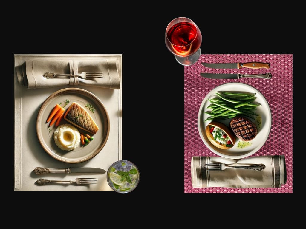
1. The Color Check
Does your palette enhance appetite—or suppress it?
· Warm tones (red, orange, terracotta) = stimulate hunger
· Cool tones (blue, purple) = suppress appetite, mute food appearance
· Yellow = attracts attention—but too much = anxiety
· Neutrals = safe zone for food presentation
Red flag: If your food looks dull or gray under your lighting or on plates—guests will taste that.
2. The Contrast Test
Does your plate contrast enough with your food?
· High contrast = visual clarity = better taste perception
· Low contrast = bland or indistinct = lower appetite
Science says: Our brain uses visual boundaries to anticipate flavor intensity. Don’t let a beautiful plate kill a beautiful dish.
3. The Lighting Audit
Are you lighting the food—or the furniture?
· Warm lighting flatters both skin tone and food
· Blue/cool lighting may look sleek—but it can make food appear cold, greasy, or colorless
Pro tip: Want guests to post pics? Give them light that flatters both the meal and the selfie.
The Bottom Line
What your guests see sets the tone. In a competitive industry where every detail matters, color isn’t just aesthetic—it’s a powerful tool for shaping perception, emotion, and loyalty.
If you’re curious how color can increase sales, boost guest satisfaction, and shape the entire dining experience—click here to dive deeper.
Dr. Melissa Hughes is a keynote speaker, author, and Human Potential Alchemist. She is the author of Happy Hour with Einstein, and Happier Hour with Einstein: Another Round. Dr. Hughes combines extensive research in neuroscience, behavioral science, and psychology to help restaurateurs and hoteliers apply science to create exceptional guest experiences.
Learn more at MelissaHughes.rocks.